Choosing a Color Palette and Materials for Your Space. One of the most common things I hear from clients is the fear of making the wrong choice of colors and materials for their remodel project. It’s a totally valid concern.
You want to make the right decision, have confidence you will get the desired outcome you want and you’re spending your hard-earned money! The last thing you want to happen is to pay for the material or put the paint color on the wall and hate it.
This is why during my consults, I walk through the space to observe lighting (both artificial and natural), ask questions about what colors and materials you do and do not like, what style(s) you like, and how you want the space to feel.
After gathering this information, the next step is to hop on over to Pinterest and start gathering inspiration photos. I start a collaborative board with my client so we can idea share and comment on what we like about the inspiration photo. This is important because sometimes what you see in your mind is not what something may end up looking like in person – so inspiration pictures are very helpful! After going on a fun pinning spree, I then narrow down the choices and create a mood inspiration board and present it to my client.
The mood board is the guide for the project. While the items on the board may not be the exact light, furniture pieces or hardware, it is the final inspiration for the overall direction of the project.
Christina Nguyen
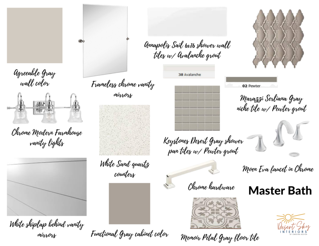
Let’s look at this mood board that was created for a master bathroom, as an example: The look for this bathroom is a twist on Modern Farmhouse. We are still using whites, various shades of gray, shiplap and patterned tile but the difference is using chrome accents instead of galvanized steel.
The starting point for this look is the floor tile. It is a patterned tile, with a medium, yet soft gray color. The color palette was built around the floor tile. Three shades of gray will be brought in – the walls, the cabinet color, and the niche tile. The grays vary a little but are harmonious in the space. The white shower wall tile will be installed straight lay, in a horizontal stack pattern, to bring in the modern touch.
The farmhouse element will be the white shiplap that will run on the wall of the vanity, from the top of the countertop to the ceiling, behind the frameless mirrors, and the vanity lights. A mix of white and soft flecks of gray is reflected in the simple and soft quartz counters. The twist is using chrome hardware, vanity lights, and bath fixtures. You could also very easily do matte black hardware, lights, and bath fixtures for a bolder look, and it would look equally as beautiful. The bathroom will then be styled with some light decor; towels, artificial succulents in pretty pots, robe/towel hooks, a bath mat, and glass around the shower entrance.
This project will be complete in a few weeks. Be sure to follow along on my social media to see the progress! Click link below:

Content by: Christina Nguyen – Desert Sky Interiors
Christina Nguyen is the owner of Desert Sky Interiors. Her passion for design and interior decorating started several years ago when she was decorating her home. The more she played with color, textures, furniture, and styles, the more she discovered how much fun it was. Christina found it so rewarding to take a plain, boring house and help it breathe new life and showcase its true beauty. She now enjoys sharing her passion with others. If you are looking to redecorate or remodel your home, Christina would be so honored to be a part of it.
Email: desertskyinteriors@gmail.com
Phone: 480-241-6936

